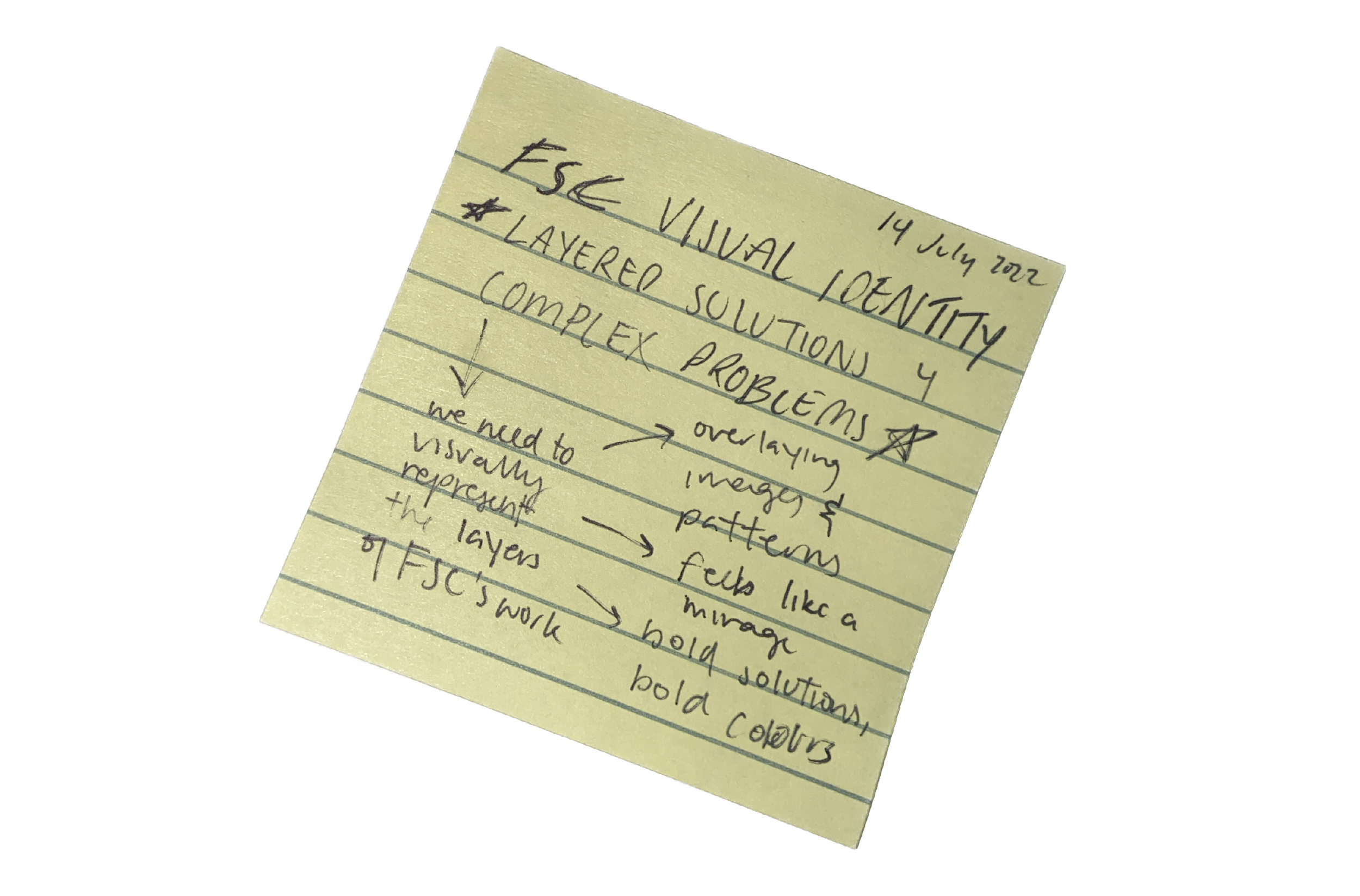
The FSC brand refresh.
The FSC brand refresh was a project I was thrilled to embark on. Discovering the gems within FSC’s existing brand and fine-tuning elements to create visuals that define it as an organization, while not limiting it, became one of my favourite projects.
This brand refresh process took months of audits, analyses, brainstorming sessions, pitches, working through endless iterations of what could be, narrowing to what needs to be and packaging for sharing internally and externally.
The investigation.
The visual pitch(es).
Based on the analysis above, I wanted to create pitch decks that summarized my brainstorming in a way that not only designers would connect with, but folks outside of the industry would be able to understand as well. This method included using examples of what previously existed in the old brand guides, and bridging these examples to written and visual explanations of what could be.
The final guidelines.
After a collaborative process spanning months of drafts and communications with upper management, we finished and presented the updated guidelines! The final brand guidelines include:
✔ Retouched logo with proper alignment
✔ Primary, secondary and tertiary colour palettes and accessibility guidelines for use of colours
✔ Updated font package
✔ Document accessibility resources
✔ Updated abstract and documentary photo library
✔ New branding content management system for ease of access and navigation


