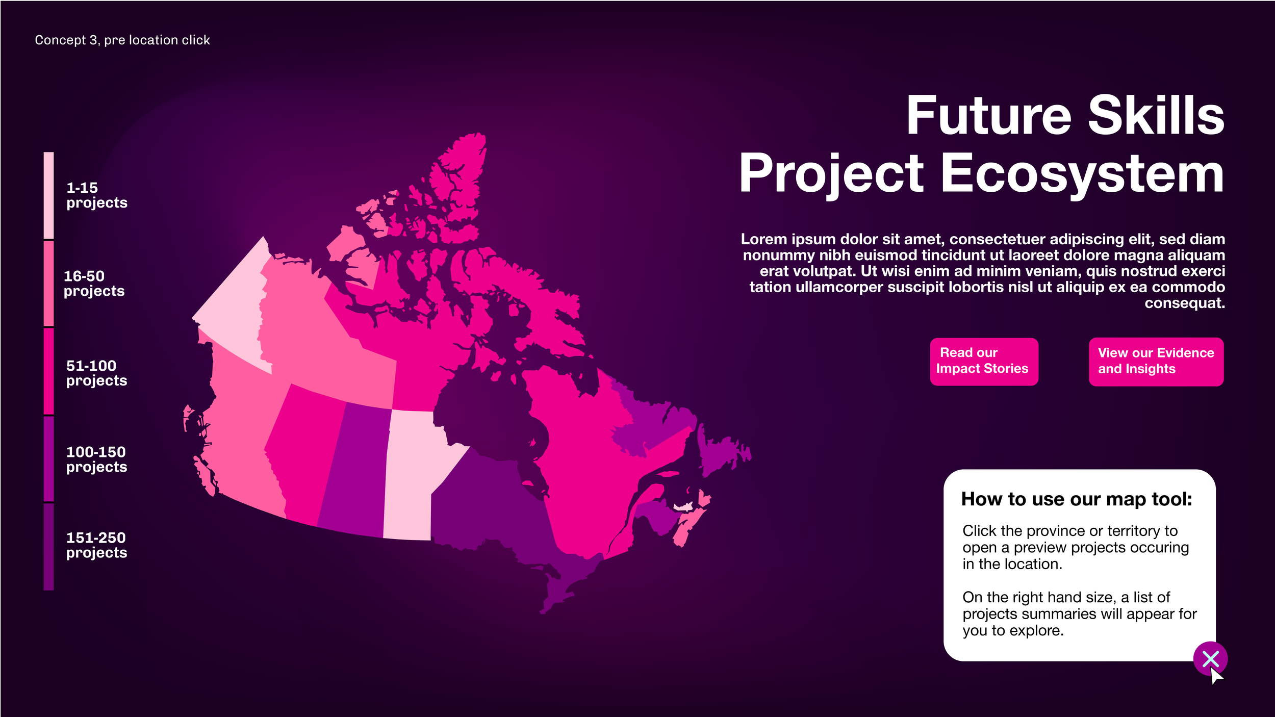
FSC’s second iteration of the Innovation Projects Map
The goal was to modernize the map’s design and accentuate the effectiveness of this tool for FSC’s audiences. Taking inspiration from the visual impact of the impact report, we wanted this map to feel immersive, like a portal into the projects supported by FSC.
Innovation project map draft iterations.
Project considerations.
Multiple target audiences.
The goal of the project map was for government officials, policy makers, project partners and researchers to be able to see the breadth of FSC’s influence across Canada. However, we had to cater the map’s needs towards an audience who is older and less familiar with interactive digital environments.
Navigating politics.
Due to the nature of the data being displayed in the map, and the political implications of the number of projects spread throughout Canada, we ultimately had to remove the colour coding of the provinces and territories to reflect the number of projects in the location. While I think this decision causes the map to feel less dynamic, it was important to pursue this route for the purpose of stakeholder relations.


