Split Rail Brewing Co. Label Design
I have been working with Split Rail Brewing Co. to redesign existing labels and design new labels for their variety of beers.
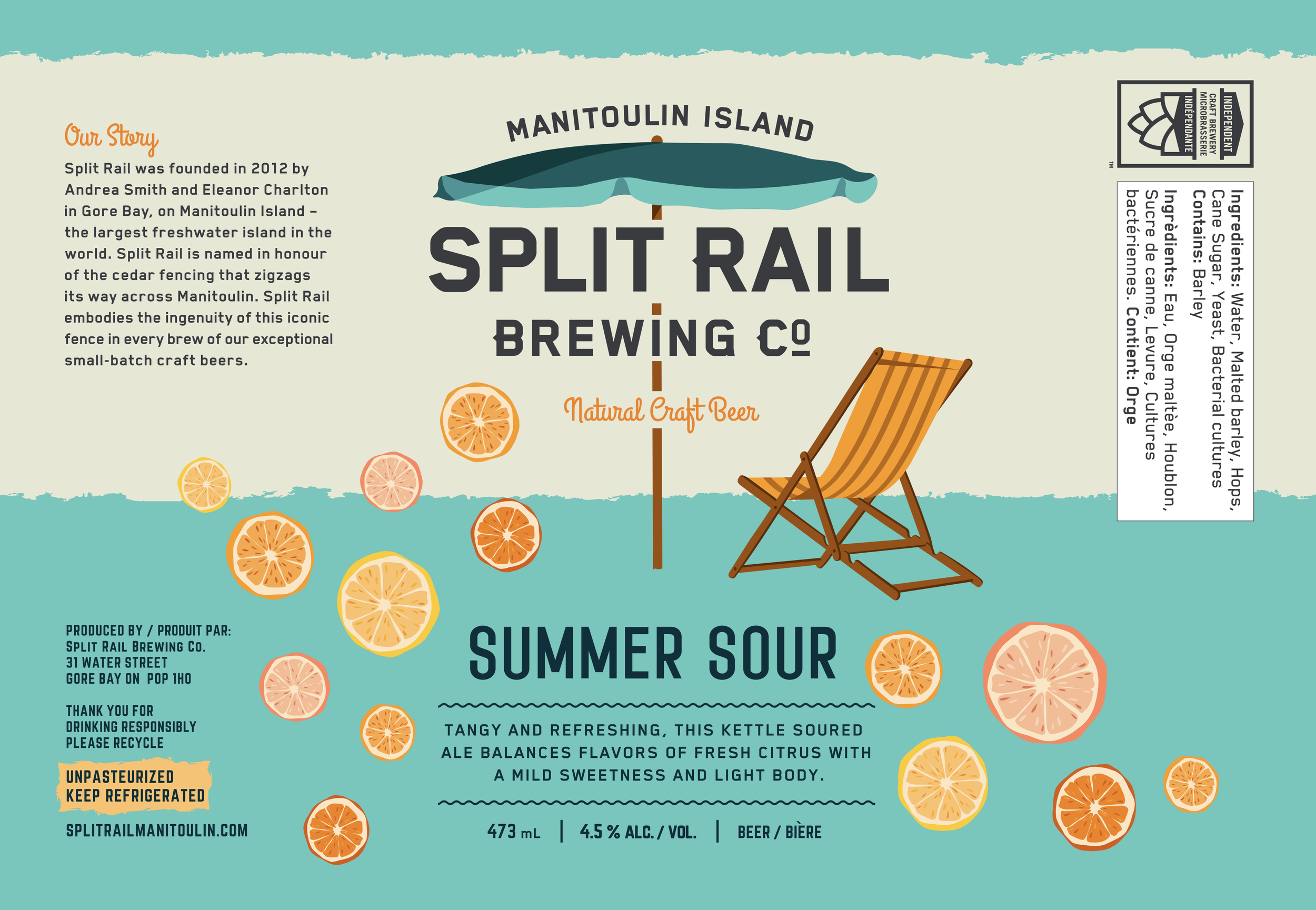
The goal for these labels was to fit them into the classic two tone colour split to ensure consistency across the different brews.
Labels Designs, 2024.


Project considerations.

Lost design files
Many of the labels I worked on were reworking designs the client didn’t have editable files for.
In the last couple of years the SR wanted to shift towards towards more modern, outline-less, colourful graphic elements and away from the traditional illustration direction, and the missing design files provided an opportunity to make this change.
Legal requirements
The most important element of this redesign process was to ensure the ingredients list was the proper size and contrast in accordance to provincial standards.
Previous labels also had some fonts used that we were unable to track down usage permissions for, so we had to transition to creative-commons declared fonts.
Aligning Brand Elements
The desire from the SR team was for these labels to line up alongside each other seamlessly. This meant working design elements into the classic two tone colour split layout, for the labels we could manage, while having a little bit of brand fun elsewhere
Before + After.

Original Design
Editable file lost

Original Design
Editable file lost, fonts not included in creative commons license.

Original Design
Editable file lost
Updated Design
Updated Design
Updated Design